The Frans Masereel Centrum is pleased to launch its new website, marking both the start of its new artistic program as well as its new graphic identity. This renewal is in full swing and will be further rolled out in the coming weeks.
The new website and corporate identity are the result of an intense collaboration with Studio.dier & Studio Mast. During the past months we co-authored with them (often virtually) this new and exciting chapter.
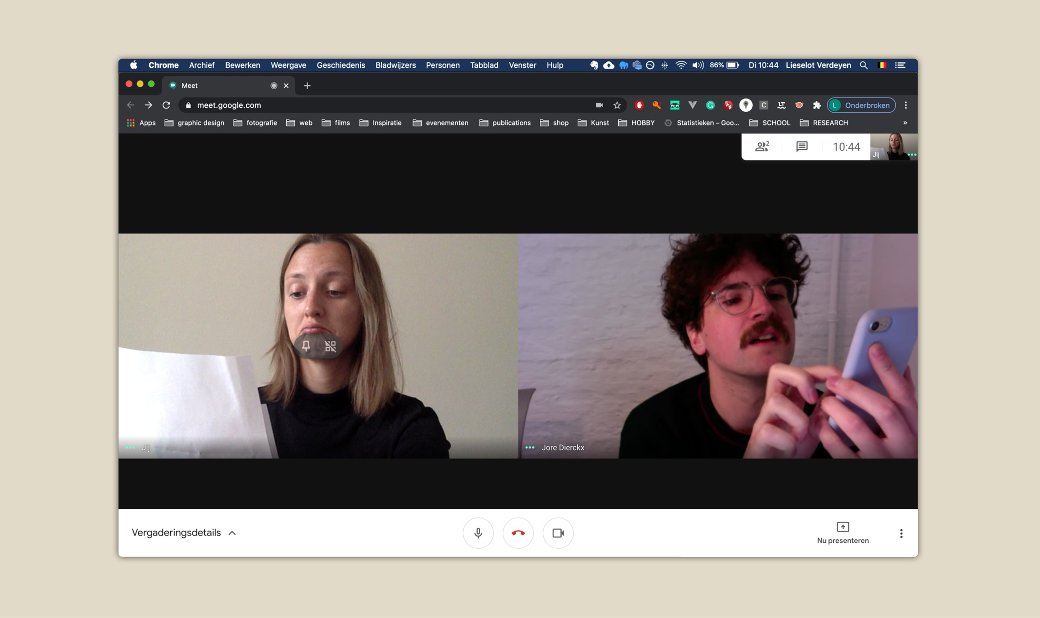
Studio.dier is the creative outlet of graphic designer and web designer Jore Dierckx. His work is characterized by experimentation and playfulness. He developed several websites, graphic identities, printed matter and autonomous work. Since a few months he is part of a group of artists who have united in the artist-run (re)production center Atelierzeven in Ghent.
Studio Mast is a graphic studio specialized in visual identities, websites, promo, and book designs. Studio Mast was founded by Lieselot Verdeyen and is currently based in Ghent. Studio Mast seeks the connection of a graphic identity with a clear concept. We love to experiment with spaciousness and typography, with an eye for the calm poses in between. Usability is one of our priorities.
Artist statement
“The Frans Masereel Centrum has an undeniably rich history in many areas. It is a unique research center that enjoys a strong (inter)national reputation. Not only its extensive collection and the many printing techniques, but also its lush surroundings, views and architecture were an important source of inspiration for the development of this renewal operation.
Thus, the architecture reflects in the use of the large rounded shapes and soft areas of color interrupted by hard lines. It gives an answer to the idiosyncratic location of the centre which is shaped by its specific architecture.
The typographic logo is refreshed while still keeping it recognizable. Therefore it was decided to keep the identifiable sphere and to adapt it in relation to the new typography and style characteristics. Moreover, the sphere is a characteristic and timeless symbol that continues to serve as a bridge between past and future.
At the basis of the new graphic identity lies the typography, which has been thoroughly renewed. The choice fell on two characterful sans serif typefaces that perfectly support each other in terms of contrast and weight. Defining the new typographical rules goes hand in hand with a new communication strategy that will be reflected in the coming period.
The new color palette stands out because of its lushness. Three basic colors and seven spot colors provide a vibrant look. The colors should further underline the vitality of the centre.
The graphic identity will develop further as a flexible whole. An identity that dares to question itself throughout its development without losing its clear vision.”
— Jore Dierckx & Lieselot Verdeyen
The Frans Masereel Centrum is pleased to launch its new website, marking both the start of its new artistic program as well as its new graphic identity. This renewal is in full swing and will be further rolled out in the coming weeks.
The new website and corporate identity are the result of an intense collaboration with Studio.dier & Studio Mast. During the past months we co-authored with them (often virtually) this new and exciting chapter.
Studio.dier is the creative outlet of graphic designer and web designer Jore Dierckx. His work is characterized by experimentation and playfulness. He developed several websites, graphic identities, printed matter and autonomous work. Since a few months he is part of a group of artists who have united in the artist-run (re)production center Atelierzeven in Ghent.
Studio Mast is a graphic studio specialized in visual identities, websites, promo, and book designs. Studio Mast was founded by Lieselot Verdeyen and is currently based in Ghent. Studio Mast seeks the connection of a graphic identity with a clear concept. We love to experiment with spaciousness and typography, with an eye for the calm poses in between. Usability is one of our priorities.
Artist statement
“The Frans Masereel Centrum has an undeniably rich history in many areas. It is a unique research center that enjoys a strong (inter)national reputation. Not only its extensive collection and the many printing techniques, but also its lush surroundings, views and architecture were an important source of inspiration for the development of this renewal operation.
Thus, the architecture reflects in the use of the large rounded shapes and soft areas of color interrupted by hard lines. It gives an answer to the idiosyncratic location of the centre which is shaped by its specific architecture.
The typographic logo is refreshed while still keeping it recognizable. Therefore it was decided to keep the identifiable sphere and to adapt it in relation to the new typography and style characteristics. Moreover, the sphere is a characteristic and timeless symbol that continues to serve as a bridge between past and future.
At the basis of the new graphic identity lies the typography, which has been thoroughly renewed. The choice fell on two characterful sans serif typefaces that perfectly support each other in terms of contrast and weight. Defining the new typographical rules goes hand in hand with a new communication strategy that will be reflected in the coming period.
The new color palette stands out because of its lushness. Three basic colors and seven spot colors provide a vibrant look. The colors should further underline the vitality of the centre.
The graphic identity will develop further as a flexible whole. An identity that dares to question itself throughout its development without losing its clear vision.”
— Jore Dierckx & Lieselot Verdeyen